 Okay, I just don't get this...
Let's say you're a large organisation of some sort... maybe a company, maybe some sort of "community based organisation"... but you're large, and quite well known...
You're running an event or launching a new product or rebranding your existing products in a new way... something that's going to get people's attention...
You've hired an artist or a graphic designer or some kind of marketing wunderkind... and they give you an advertising image, which you're very happy with...
You use the image in your advertising... you make up posters and send the image out to appropriate media outlets...
You also have a website, and at least one, if not a team of dedicated website individuals...
But the new advertising image doesn't show up anywhere on your website, and you don't make any kind of changes to incorporate that visual style into your online branding.
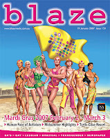
Obviously I'm talking about the Mardi Gras... but only because it's the most recent instance of this... I picked up a copy of the SA gay newspaper, Blaze (and don't even get me started on their website direction), on Saturday and there, on the cover, as you can see, is this kickass image for Mardi Gras... and there was also a double page spread in the middle of the paper too... same image, but differently arranged and with lots of text and details about events. I instantly fell in love with it, so I decided to hit the Mardi Gras website, see if they had a copy of it without as much text, maybe some information about the artist so I could dig around for more of his work...
Nada... zip... zilch... bubcus...
Actually, looking at it again this morning, that's not completely true... the green clad drag queen shows up in a 55 pixel high image on the sidebar directing you to the ticketing site.
But, c'mon... look at the image... it's PERFECT for disassembling and turning into various and sundry website graphics (especially if the artist used Photoshop or something similar on it and each of those characters can be separated out from both the group and the background), as well as the little "Objects of Love" (allegedly the name of the campaign or the theme for this year's Mardi Gras, but I couldn't find any reference to that online either) icons in the flag, which actually remind me a little of one of the Mardi Gras campaigns from the early/mid nineties... with the silhouette heads on different coloured backgrounds.
It wouldn't even have taken very much work... just change the colour scheme on the website (I'm thinking the yellow with pink and green accents)... replace the images in the top banner with the image from the poster or some animated version of the love icons... and hey presto, branded and brand new looking website... it's not like you would have to change the site that often... Mardi Gras only comes around once a year, and you could so back to the boring orange design once the whole thing was over.... add the new branding towards the end of the year once you've got it ready...
What's actually worse is that while I've been flicking around the Mardi Gras website, I've found that the Sleaze Ball page has some exactly what the main page should have done... they added a copy of the poster image and told you that it was by the ever fab Glen Hanson... now whether they did that before or after the event itself I don't know...
And given the surge in bloggers and blogging in the past couple of years, would it have killed them to make a few little link buttons/banners that we could have used to link back to the site? Okay, so that one isn't so important, but it they'd come out with buttons for each of those little characters I would have been tempted to add at least one to the site (long shorts at the far end).
But it's not just the Mardi Gras, like I said before... a lot of other organisations do it. They make a brilliant poster ad campaign and you see it out and about or in magazines or whatever, but it never appears anywhere online.
It's called holistic marketing people... look it up...
Current Mood:

3 comments:
hey you've almost stolen my identity. except i'm straight and you're gay. i hope you have msn due cos i would like to chat over msn.
You know what else I hate? When a magazine ad sends you to their website but the website only contains a .jpeg of the mag ad. What is that? An attempt to impress people with how crap they are? No wonder Sleaze in Brisbane has been struggling (though this year was pretty good).
Clever picture too as 2007 is the year of the surf lifesaver!
Post a Comment