 It's official...
Blogger's whole new Layout Customisation feature SUCKS!
Grrrr... I fiddled and I fiddled and I fiddled... and while I'm sure it's wonderful for those people who don't know their proverbial ass from their proverbial elbow in the world of CSS and HTML... if you want something to use as a starting point so you can have a unique look, well, to coin a phrase... IT SUCKS!
I'd expected that it would be the whole design side that would be full of bells and whistles and then it would just dump the whole thing down into decent CSS/HTML and you could edit if from there... but oh no... that would be far too easy... and all that new layout guff happens in "widgets"... now I don't know from widgets... I do know that "widget code" is completely incomprehensible and, as far as I can tell, uneditable... so after staring at it and getting increasingly frustrated with the whole box and dice, I just decided "screw it" and I went back to the "Classic Template"...
On the down side, this means that I can't have the nice new collapsible archive list thing (although I was less impressed with the bracketed numbers after each entry telling you how many posts there were... actually both on the archive and the labels list)... or the "Older Posts" link at the bottom of the page... and I'd like those... really I would... but I'm guessing you can't mix and match from the old template to the new template...
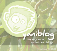
But I did decide to do a whole new look to the sidebar image... I moved the blog name over there... and the description... actually, I kind of did a whole "rebranding" of the thing now that I think about it... and I also quadrupled the length of the sidebar image (for almost no additional file size, which I was impressed with)... plus added a faint colour background that somebody suggested back when I first changed over to this template...
So... yeah... not as completely the brand new look and feel that I was kind of hoping for... but a definite step in the right direction...
Now, since I've been working on this all morning and it's now well past lunch, I think I'm going to go off and make myself some food...
Oh, and before I forget... Happy Birthday Eddy!
Current Mood:

5 comments:
I stopped by earlier and saw the lighthousey thing - didn't think it looked unique enough for you!
It passes the mac test! - not that you're interested I'm sure! :P I like the more prominent avatar/logo thing!
Although interestingly enough the lighthouse template is the basis for the template I've been using... just with a bunch of minor alterations...
And you know how I love it when things pass the Mac test :P
Ummm... could you work on mine?
You can edit your widgets, although I've only looked at it breifly and it's nowhere nere as friendly as the originally blogger tags. When you edit the HTML of the template there is a little checkbox with "expand widget templates" which will let you edit them -- if you want to get really stuck into the sucky psuedo-coding thing. I love the idea, but really really hate the implementation.
I have a feeling that you might be able to use the original blogger tags but that it's not as powerful as the new template format.
I only just saw this. :P Thanks. ;)
Post a Comment