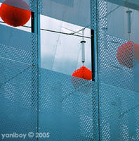
 Woohoo... colour me so impressed with myself... hehehe.
I decided yesterday that I was bored with my old template and needed to make a new one... but I had no idea what to use... nothing was really saying "this is yani"... then laying in bed last night, I remembered a very cool photo I took in Melbourne (see right) at Federation Square. I have no idea what the place was, I'm guessing some über-chic Asian resturant... all minimalist steel and red lanterns... looked pretty cool from down on the ground though. Hence the photo.
So this morning I went through the process of tweaking both the photo and my existing template into something much cooler... Course I did go a little insane at one point due to a gap that kept showing up, since I couldn't work out why it was there. Got it eventually though, as always with CSS, it was one simple little adjustment.
And I give you... yani.redlantern!
Current Mood:

2 comments:
[Sweeps in and surveys cyber-scene ...]
Lurve what your done with the place! Liking the hi-tech urban Zen edge thing you got working for you. Very uber-cool and tres-chic.
[and sweeps out again]
Wow!! The moment I surfed onto the page to check up on the latest, the first thing I noticed was the new look. Absolutely awesome!! Love the pic!!!
Post a Comment